Wk. 7 – Classmate Conversation – Aaron Satterfield

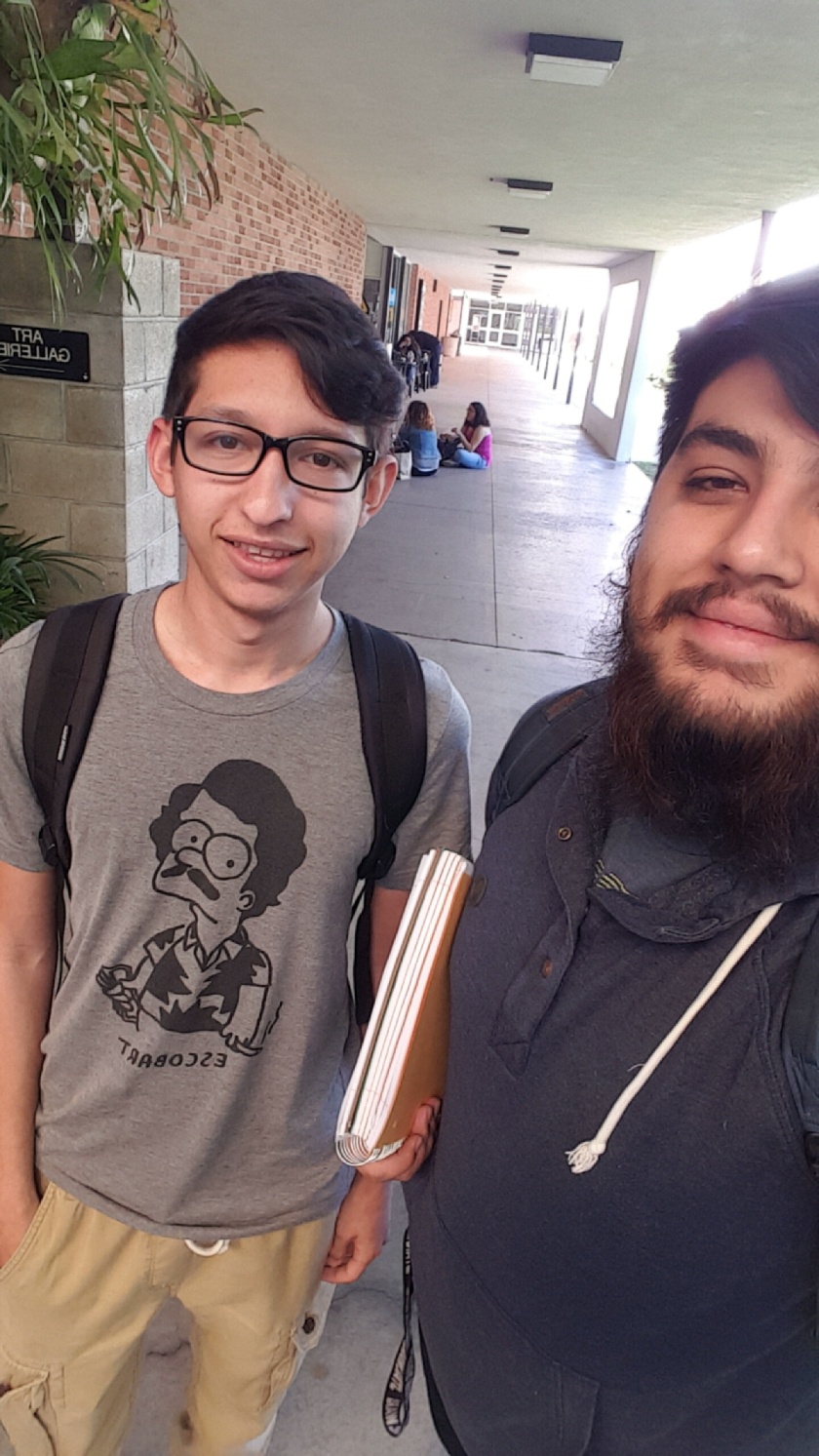
I had the pleasure of meeting Aaron Satterfield this week.

He’s a computer science major here at CSULB and he designs apps for a startup company that he works for.

He was very excited about an app they just released that recreate the popular “Damn, Daniel” phrase over any video you record.

He told me that he wrote the application all by himself and that it had taken him about a week to do so.

Wk. 7 – Art Experience – Group Video Activity

For our group project we decided to do a Doritos commercial. We were in a group chat and when the idea was thrown out a few ideas were thrown into it and we went with the commercial.

We had a general script/idea for it but while in production we decided to add stuff to make it a bit more comedic.

I had a really fun time doing this video. My major is actually in Film (screenwriting) and doing something like this was just a fun little activity that only reinforced my passions.

Here is our group’s video!

Wk. 5 – Artist Conversation – Kristi Jensen

Artist: Kristi Jensen

Exhibition: Fuse: Join to Form; single entity

Media: Steel, silver, copper

Gallery: CSULB School of Art, Gavov Gallery East

Website: N/A

Instagram: whipperton

image

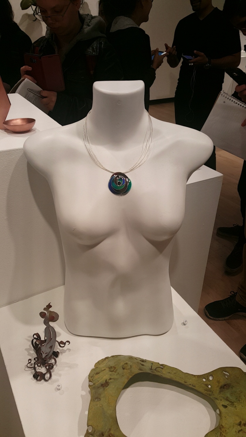
This week’s artist is Kristi Jensen. She is a returning student with a Bachelor of Fine Arts in Metals and Jewelry. She couldn’t name somewhere she’s from because she claimed to be from all over. She moved around a lot and even said she went to 10 different elementary schools. Ironically, she had a job once that had her doing the same thing–she was a flight attendant. She was inspired by her grandfather and the way he would fix the television, piece by piece. One fun fact about her is that this event was the first she ever curated. Another series of fun facts would be that she is married with dogs, she cooks, and enjoys a casual glass of red wine.

image

Her works are as much jewelry as they are metalwork. She uses silver (sparingly) and copper the most. A visiting artist has has noted that her work has a recurring motif of curving. Judging from the three pieces present in the gallery, I would have to agree. The piece above is swirled inwards and curves were inevitably present. It was a beautiful piece as well, the shade of green seemed like a naturally-occuring shade.

image

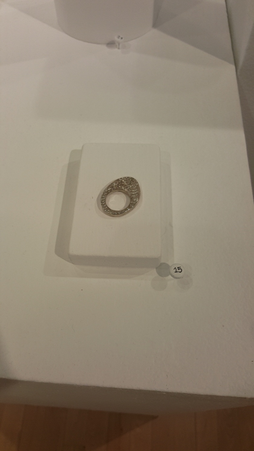
It’s hard to pin down what metals mean in terms of contextual meaning, nevertheless the pieces were beautiful.

image

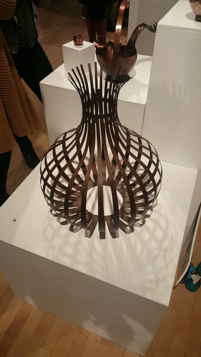
This piece was my favorite in the gallery. I love symmetry and this piece had pinned down symmetry in multiple dimensions and it was aesthetically pleasing. A masterpiece in my eyes. What interested me was that all of Jensen’s works were Untitled. But the work speaks for itself. No need for a flashy title when she’s made a fantastic piece of jewelry and symmetrical eye-candy. Upon asking her why they didn’t have titles she replied, “I’ve just always been bad at naming my pieces.”

Wk. 5 – Classmate Conversation – Patrick Dong

image

This week I had the opportunity to meet a classmate by the name of Patrick Dong. He approached me and asked if I had interviewed anyone and after finding out that I hadn’t, he insisted on being interviewed. He is currently on his fifth year as an undergraduate in the Mathematics program. With his degree he hopes to be a teacher/professor in math.

On his spare time, he takes part in photography (a few samples of his work are available on his WordPress I provided above).

He also is a member of the CSULB Shotokan Karate Club. He plays guitar and watches Korean Dramas and listens to KPOP.

Wk. 4 – Art Experience – Graffiti Writing

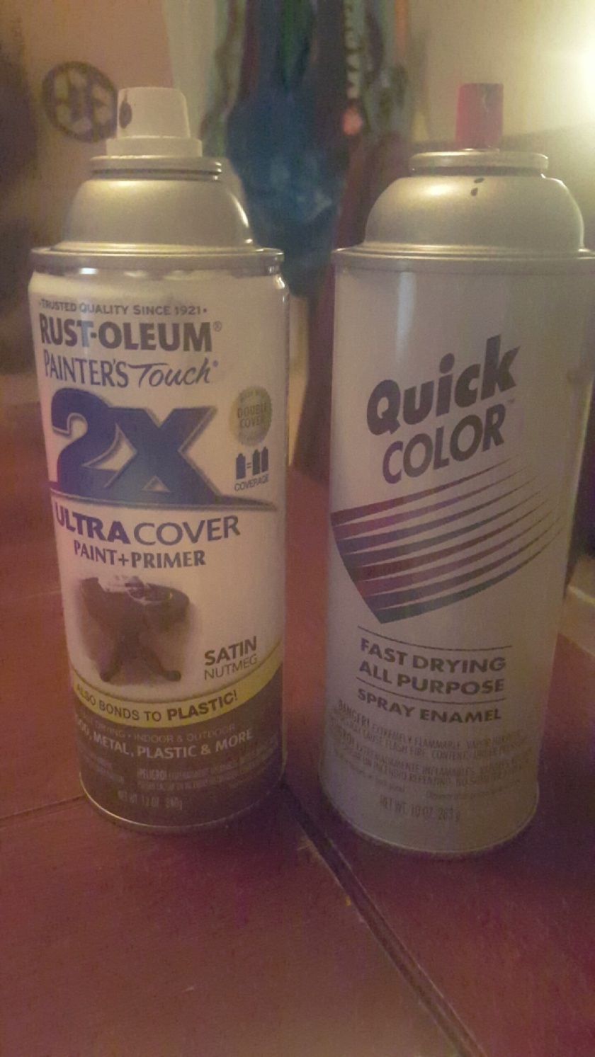
This week’s artist experience was definitely a favorite of mine. I didn’t get the chance to go to Venice Beach because I was afraid to. I got sick last time I went and it’s unlikely I’ll go back because the eccentrics in the area infected me last time. But I did it at home with my two colors: Brown and Black!

image

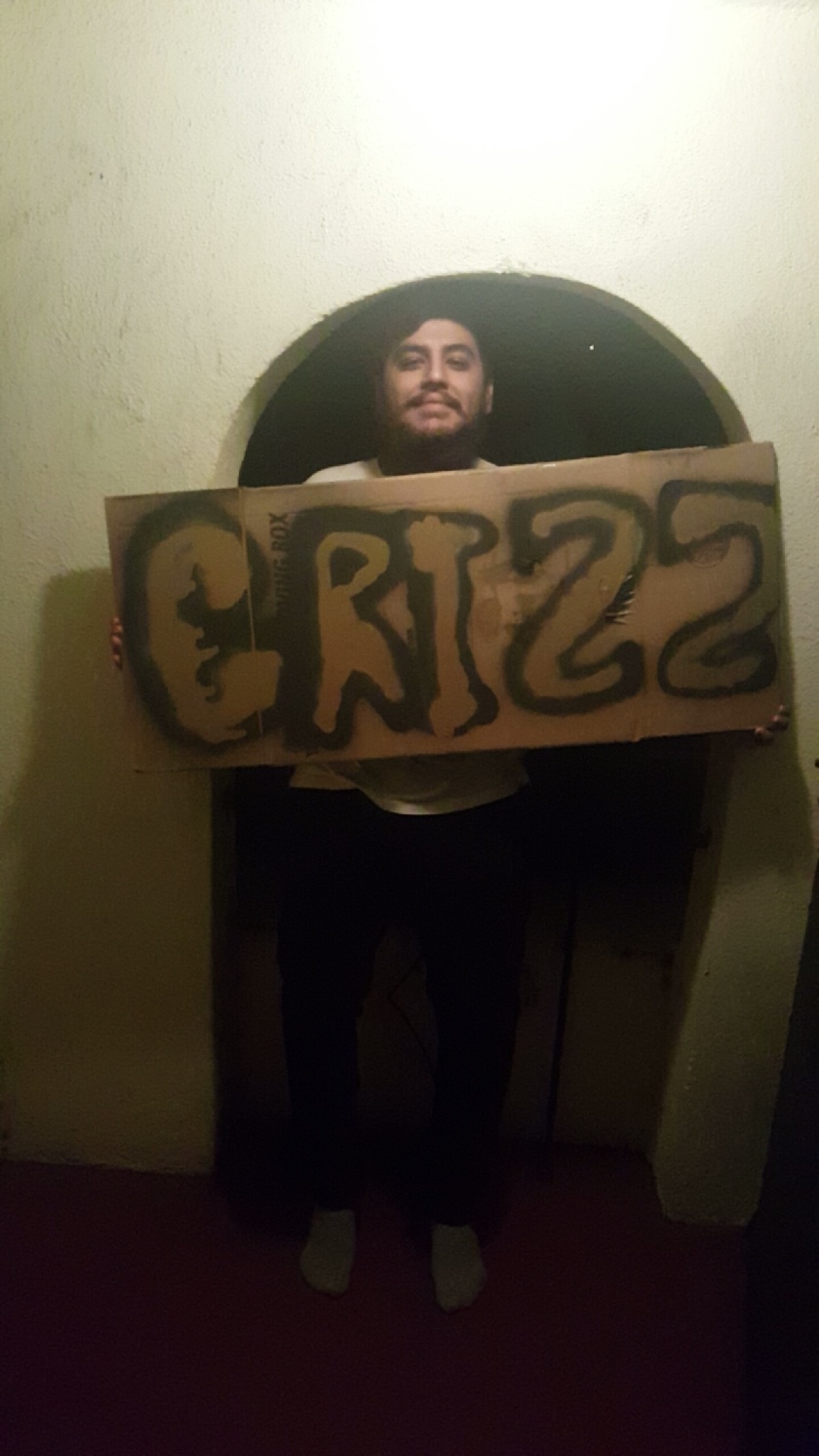
I used an old moving boxes we still have since we moved in a few weeks ago. Unfortunately, the color of the cardboard was brown and I selected brown for a specific reason. My reason? My name is Christian (or Chris for short) and my friends know me for being hairy. I’m bearded and I have an overall grizzly aesthetic. So rather than calling me Chewie (as in Star Wars’ Chewbacca) they resorted to calling me Grizz–a play-on Chris. 

image

That’s a G, by the way. Excuse my bad art, but I have the artistic talent of a melon.

Wk. 4 – Artist Conversation – Samuel Jernigan

Artist: Samuel Jernigan

Exhibition: The Weight of Whimsy and Ideals

Media: Ceramics, Sculpture

Gallery: Gatov-West

Website: cargocollective.com/samueljernigan

Instagram: samueljenri

image

The subject of this week’s artist conversation is Samuel Jernigan. Jernigan is a graduate student that graduated from CSULB with a Bachelor of Fine Arts in ceramics last fall. He has worked as a production artist but his passion for creating is 16 years old as he has been an artist since 2000. But his love for ceramic art is 7 years old now. He spends hours upon hours on his work. But when he isn’t working on his art he is binging “shitty television”, enjoying “witty comics”, and (to my surprise) not drawing.

image

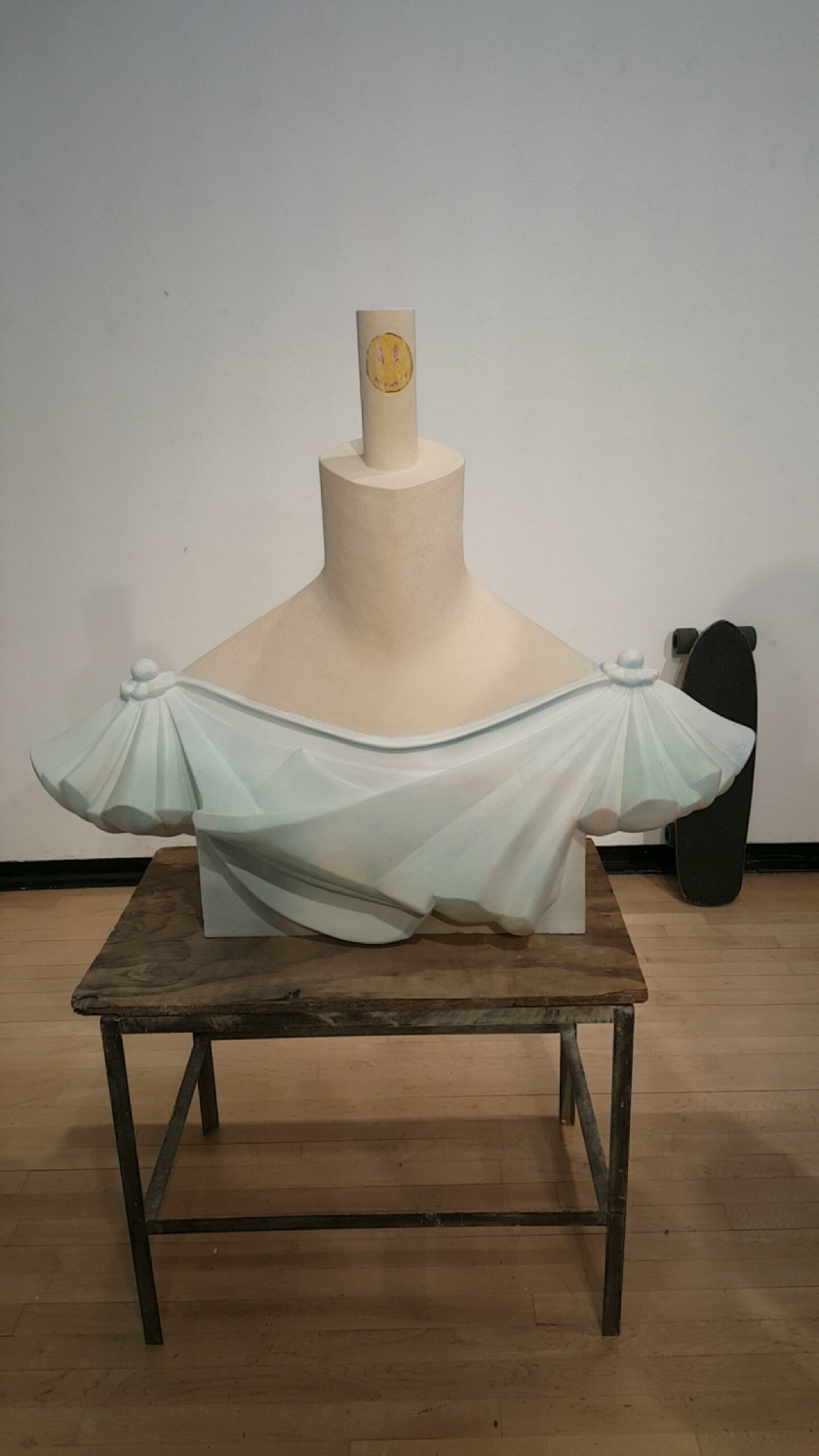
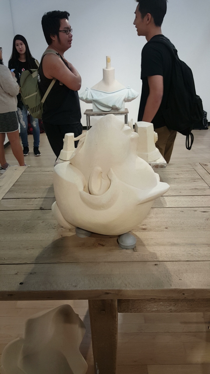
Jernigan places a of his focus on ceramic art, which is solely what was exhibited in this gallery. Jernigan uses the usual materials to create the base of the ceramics. But to apply color to his work, Jernigan prefers spray paint because “it doesn’t run”, as he claimed. What stood out was how his work seemed faded, yet intentionally faded. The scale of his work is almost life-sized. A good amount of his work was the size of a person, a few were small enough to share a table space, and a few were the size of toys.

image

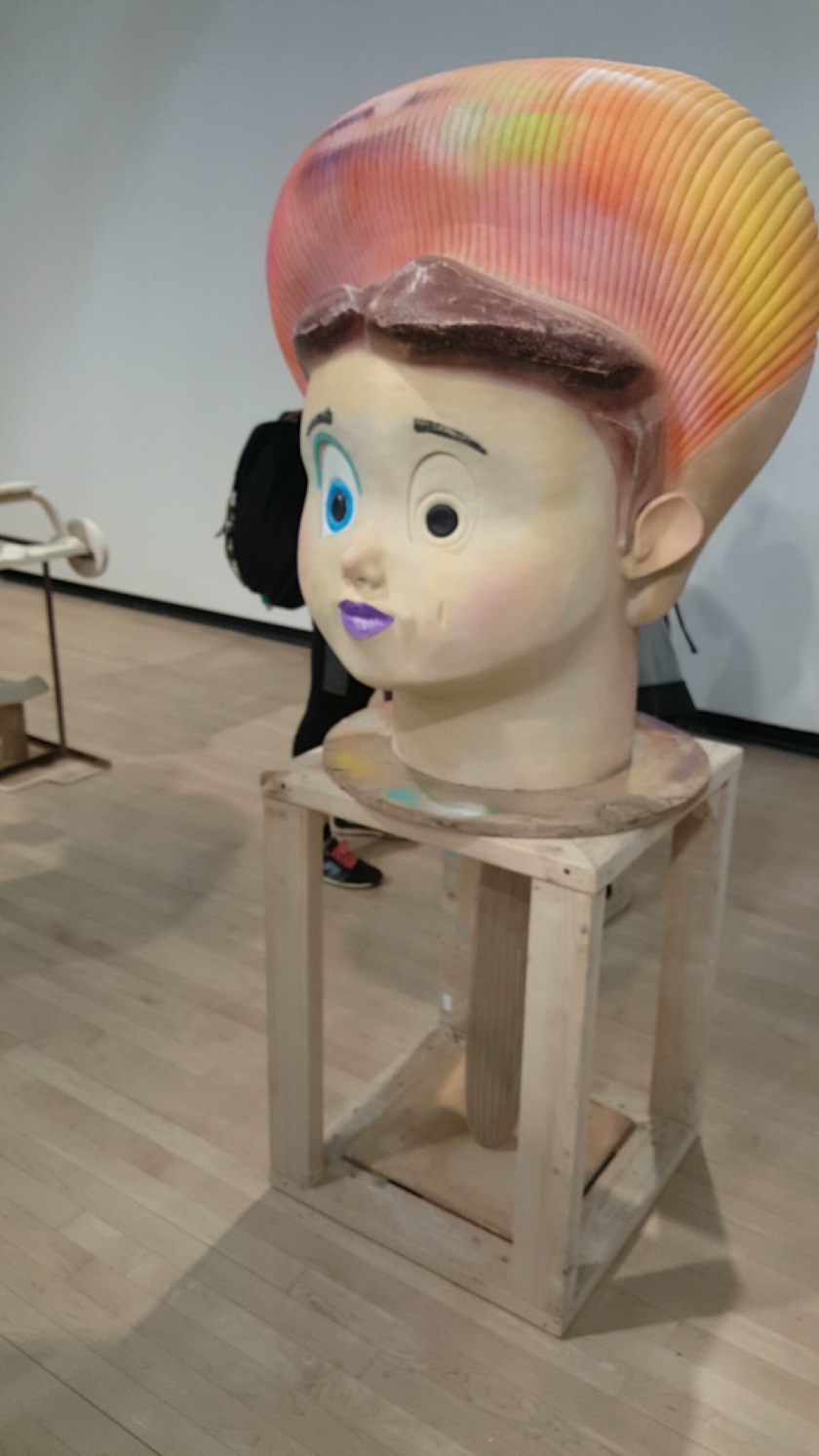
Jernigan’s art was beautiful. He was inspired by broken and mistreated toys he encountered at a flea market. He appreciated the beauty in the toys and from that he was inspired to reinstate the beauty of the toys. He did so in his pieces in which the toys are brightly colored, yet maintain a faded aesthetic. To Jernigan, it’s all about belonging.

image

This art meant a lot to me. I felt like I myself found old toys when I walked into the gallery. But I immediately noticed the faded aesthetic of the pieces and it reminded me of a faded youth–like a time long lost. There’s a story behind each of the broken, disoriented, and faceless pieces with colors that have lost their youth.

Wk. 4 – Classmate Conversation – Oscar Alvarez

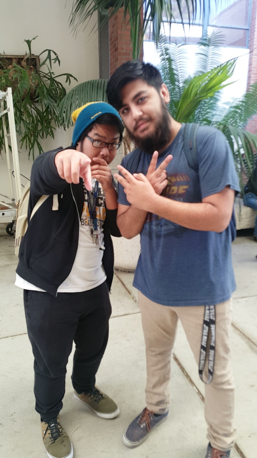
I had the opportunity to meet a classmate named Oscar Alvarez this week. I arrived to the gallery a few minutes later and I asked him what I had missed. After he told me that nothing happened so far I asked if he wanted to be the subject of my classmate conversation for the week. He agreed and it was then that I learned that Oscar is a second year student at CSULB and is in the Psychology program. When he isn’t at school he likes to make music on his laptop. Oscar is quite taken with hip hop and the music of Kanye West. At the time we spoke he was anticipating West’s new album “Waves”, but I’m sure as you’re reading this now he is currently enjoying it since the album dropped yesterday. But he makes his living by working with a moving company. He was excited to share that once he even worked a job for Ellen DeGeneres! He also shared with me that he drives a 2002 Toyota Celica. A fun fact of his that he felt like sharing was that he was colorblind. He also shared the story of how he discovered he wasccolorblind when he was a child but it may not be appropriate of me to share personal information.

image

Wk. 4 – Film Screening -“Wall Writers”

Roger Gastman’s Wall Writers closely examines the roots of the graffiti movement in New York City and Philadelphia with the help of the founders of the movement itself. What stood out about this film was that the subjects of the film itself gladly contributed to the film and even participated in the interviews.

Along with documenting the rise and impact of the graffiti movement, the film also provided a narrative to inform audiences of the impact of the movement. The movement started as children wanting to put their names on things with monikers to denote the artist behind the graffiti. “It was all about notoriety”, claimed a pioneer to the graffiti scene. Notoriety is what drove these young writers to cover their neighborhoods and their cities with their street names. But the scene blew up and newcomers arrived on the scene and stepped it farther and farther away from its roots. As the graffiti made itself more and more noticeable, the city government began to fight back with initiatives to prevent the spread of more graffiti. They allowed the writers designated spaces to let them paint and draw on like buses, murals, and rooms. The kids that started the movement identified as “writers” rather than artists, but it wasn’t until an artist appeared to them to privatize their writings.  This artist sold their art for a large profit and gave them very little for it. But this was just the beginning of the movement, as director Roger Gastman said, “The graffiti scene hit other cities after the events in the film. It comes and goes in popularity. . .”

Following the screening of the film, Director Roger Gastman stuck around to answer some questions. Prior to the screening, he made it known that he himself is a graffiti artist and has had several commissioned works for large companies. Knowing that this was an area of interest to him I asked, ” Why did you feel this story had to be told?” To which he replied that the graffiti culture got its start from those people, and as time goes on the pioneers of the movement were slowly dying off and it would be harder to accurately tell the story without their side of it.

Wk. 3 – Classmate Conversation – Brandon Nhem

Screenshot_2016-02-07-18-29-47.png

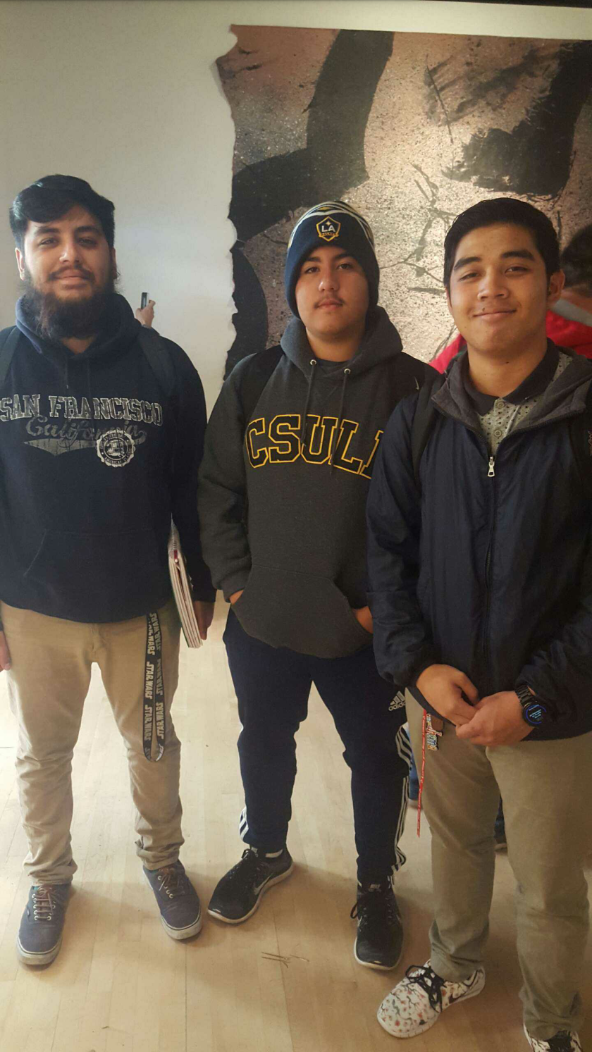
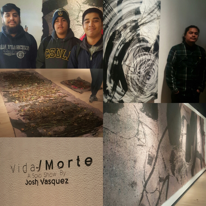
I had the opportunity to meet someone else that took part in Vida/Morte, freshman Brandon Nhem. Brandon has yet to officially declare a major but he has expressed interest in Health or Kinesiology. But it is his first year at CSULB and his second semester. When Brandon isn’t at school he is collecting vinyls. He likes to get his vinyls from Fingerprints here in Long Beach. When he’s looking for vinyls, he likes to maintain a balance between mainstream and lesser known records. He admitted to having a YouTube page that he used to use in high school because he made a few videos then. When the topic of Vida/Morte came up, Brandon thought that what made the art unique was that it underplayed death. In Josh Vasquez’ art, Brandon was able to find a beauty in it that made death seem pleasant.

Wk 3 – Artist Conversation – Josh Vasquez

Instasize_0207205016

Artist: Josh Vasquez
Exhibition: Vida / Morte
Media: Mixed-Media, Painting
Gallery: CSULB School of Art, Gatov Gallery West
Website: N/A
Instagram: joshybehr

Josh Vasquez is a Los Angeles native and spent most of his life in the Downtown area. From a young age he loved to paint and it seems like his love for the arts has gone unchanged since he is currently an undergraduate at CSULB pursuing his dreams. Vasquez is enrolled in the School Art and studying in Painting and Drawing. When asked numerous times by the visiting ART-110 class what his hobbies were, he replied each time with “I love to paint”. The love for it was apparent in his exhibition, Vida/Morte, where Josh Vasquez illustrated life and death in the same pieces while maintaining the separate identities.

Vasquez described his work as abstract. I’m no art aficionado so I will agree that it is abstract. His pieces were in black and white, such is life and death in the eyes of the artist. He painted on stretched plastic (trash bag) and used spray paints, paint, and permanent markers in a majority of his pieces. His piece, Rosado, features a what may seem like a spiral featuring thick lines from spray paint and thinning inward. The lines throughout his works are jagged and mostly thin. I was later told by the artist that what I thought was a spiral was actually a rose. The rose is a recurring motif in his works as are the skulls.

Josh Vasquez’s work in this gallery is about Life and Death. He purposely uses black and white in his work to denote the differences between the two because the purpose of the gallery is to illustrate the two as being separate ideas. But a harmony is created when they’re placed in the same pieces with flowers (life) and skulls (death). I asked if anything provoked him to create this, perhaps a death in the family or maybe a newborn? But Josh claimed that nothing provoked the art, it was just an idea he had. A classmate had noted some aggression in his piece, Rosado, and asked about his state of mind when he painted it. To that Josh replied that frustration didn’t drive the piece. In fact, he practices meditation so he paints in a meditative space.

His art was beautiful and Rosado was especially captivating.  It was the first time I walked into the gallery and Rosado pulled me in. What captures me upon first viewing the piece was what I believed to be the spiral. I received the chaotic appearance of the spiral as being the frightening appearance of death. The looming shadow that overtakes all without notice. The thick lines up top so full of life wore thinner and thinner as the eyes ventured downward. And at the bottom of these lines was the cloud. I later learned that the chaotic cloud is a rose. So what I perceived as death was redefined as being the symbol of life. Thus reinforcing the meaning behind Vida/Morte, that life and death can be within the piece yet maintain separate identities. This resonated within me because often times life can be going terribly. When life seems to be falling right down to rock bottom, I often make the same mistake I made viewing Rosado. I mistake the chaotic, horrifying cloud that I think is overbearing my life for what should actually be the rose in my life. I don’t always see that life is a blessing and a miracle in itself.